It used to be that when we used the term “partner” here at impact.com, we had to explain ourselves. We had to define what we meant by a partner, the partnership economy, and why the business world needed to take notice.
They did take notice, and the entire marketing industry has since adopted the language of partnerships. So now, we don’t have to define what we mean.
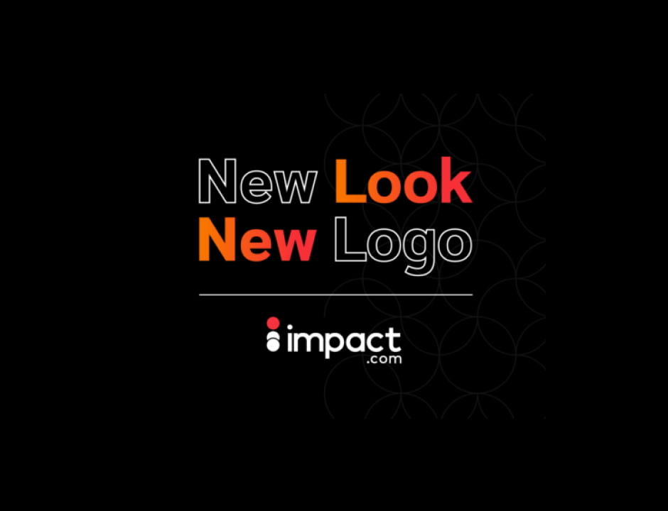
It may seem like a small thing, but it’s a big symbol of how far the industry has come. So, too, is the new brand look and feel we’re launching today.
Our fresh new impact.com color scheme and logo are small changes that represent a momentous shift in the industry and our role in it.
Partnerships have arrived
As pioneers in the developing partnership channel, we for many years found ourselves serving as educators and messengers, sharing news from the frontlines of a new and uncharted landscape. Today, partnerships are a solidly established ecosystem, with some brands deriving 28 percent or more of their revenue from partnerships and traditional advertising down for the count.
We no longer have to explain why or convince anyone that partnerships are essential to business growth or that they’re the future of marketing — because they’re already here.
Inspiring partnerships
In this more mature landscape, impact.com is ready to inspire the world with the power of partnerships. Our mission now is to make partnerships exciting to discover, manage, and scale, so we want our brand look and feel to be just as exciting and inspiring.
Our new look is a celebration of our commitment to inspire you, energize you, and empower you to thrive in the partnership economy. Welcome to a bright new day!
Need a boost of inspiration? Reach out to us at grow@impact.com.


