

According to impact.com’s Global State of Affiliate Marketing Report 2025, 21% of brands found that partner recruitment and onboarding are among the 3 biggest challenges in affiliate programs. But program performance doesn’t start with your partner mix or commission structure. It starts with the page a prospective partner sees before they ever apply.
Your affiliate program landing page is your first pitch to every publisher, creator, and media partner who might promote your brand. Get it right, and you attract partners who are genuinely aligned with your program. Get it wrong and the partners you want move on—and the ones you don’t want fill the gap.
In this guide, you’ll learn exactly what to include on an affiliate program landing page, what each vertical’s best programs do differently, and how to build a page that converts the right partners—with real examples from HubSpot, Semrush, Olipop, and Castlery.
What an affiliate program landing page needs to do
Before you write a word of copy, understand what your page is actually trying to accomplish. A prospective partner lands on your page with three questions:
- Is this program worth my time to apply to?
- Will this brand actually support my success?
- What do I need to do to get started?
Every element of your landing page should answer one of those three questions. If it doesn’t answer these, cut it.
The five elements every affiliate program landing page needs
1. A clear headline that states the value proposition
Your headline has one job: tell a prospective partner what they get from promoting your brand. Not what your brand does, but what the partner gets.
Most brands make the mistake of leading with their company story. Prospective partners don’t need to understand your business model before they apply. They need to know what’s in it for them.
Include:
- Commission rate or range—be specific. “Earn up to 30%” is stronger than “earn competitive commissions.”
- Cookie window: longer windows signal a program that values partners. 30 days is a minimum; 90–120 days is a differentiator.
- One benefit that distinguishes your program: tiered payouts, a dedicated account manager, co-branded assets.
Avoid:
- Vague language like “join our partner community” with no specifics
- Leading with your brand story before your commission structure
- Hiding the commission rate below the fold or in the FAQ
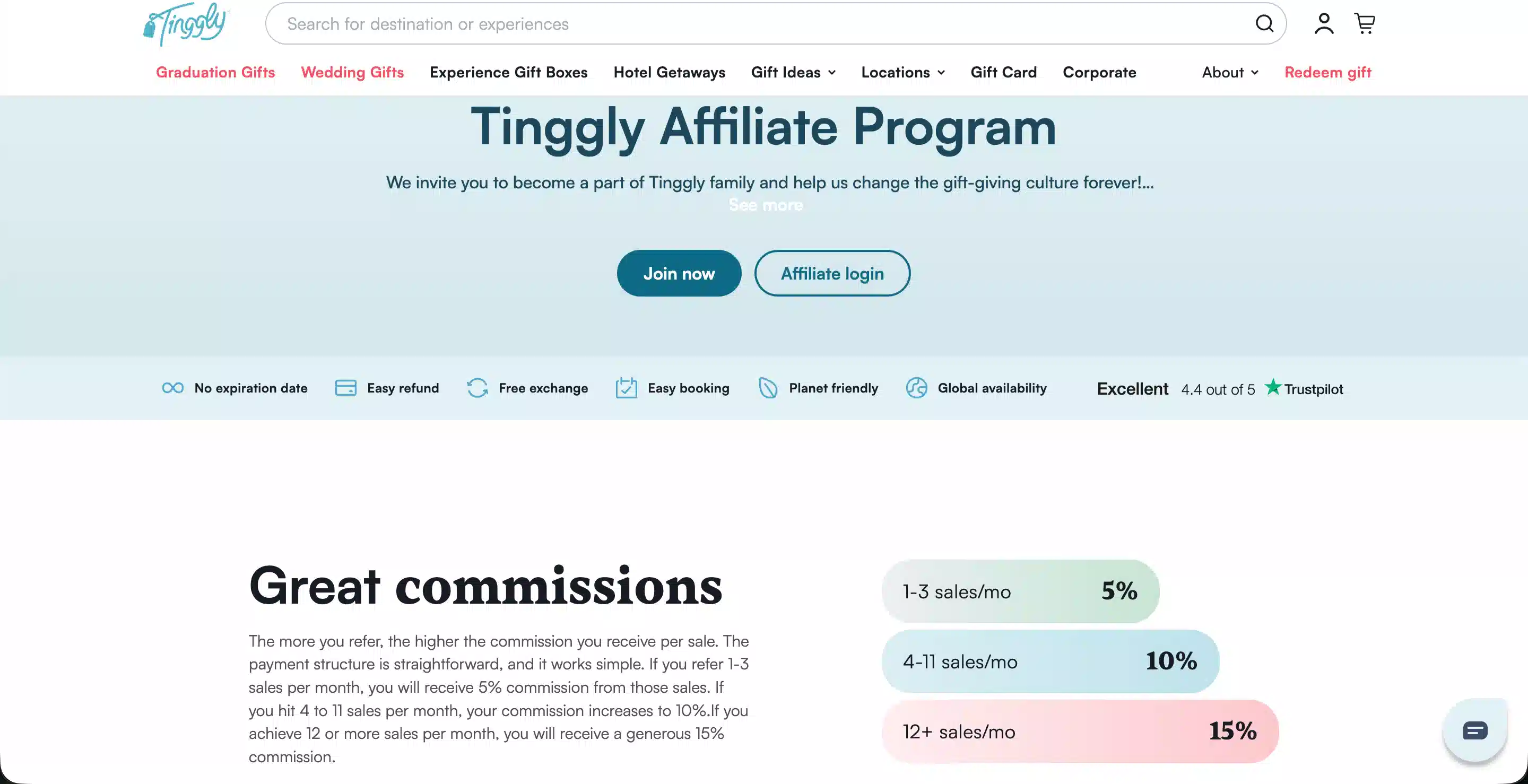
Tinggly’s affiliate program landing page includes the headline, CTA, and commission tiers above the fold.
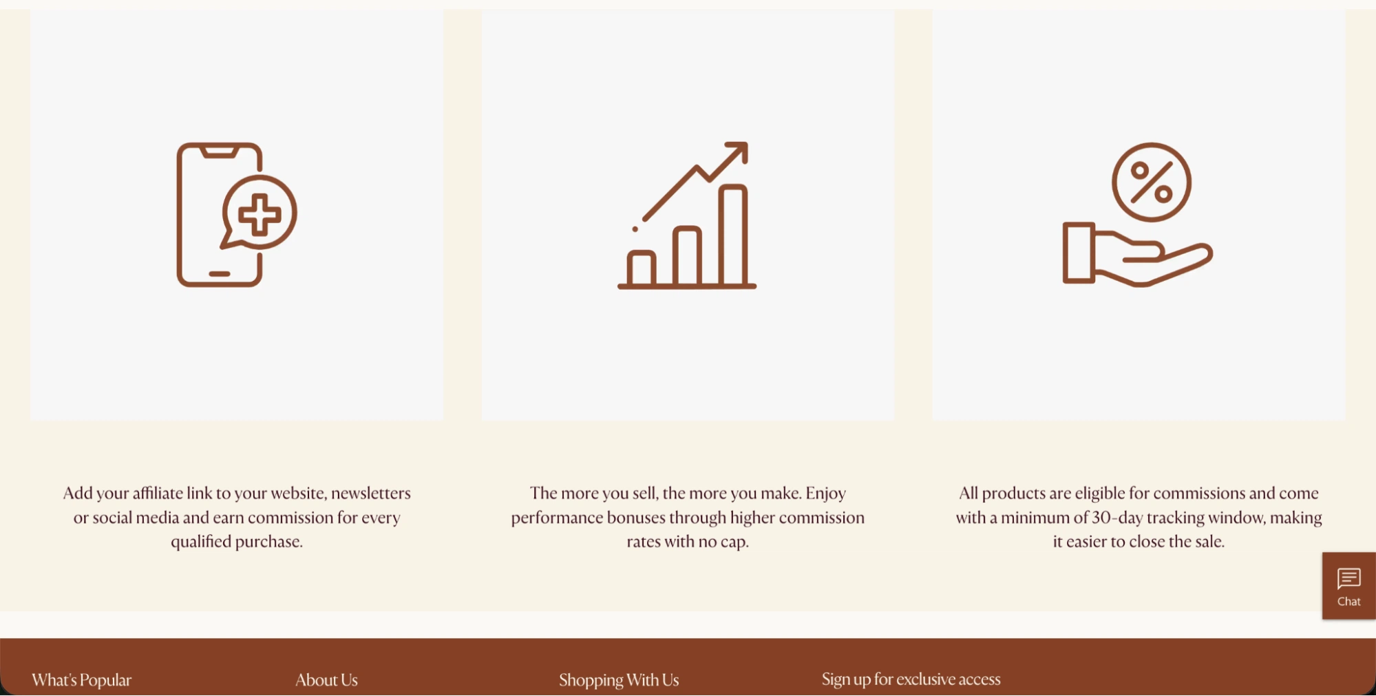
2. A complete commission and program structure section
After your headline hooks a prospective partner, they need the details. This section is where most brands undersell their programs—they list a commission rate and nothing else. Strong programs treat this section like a sales sheet.
Include:
- Commission type with context: flat CPA, percentage of sale, or tiered by performance
- Cookie window with context: explain why your window suits your buying cycle
- Payment schedule and minimum payout threshold
- Partner tier structure if applicable—what added incentives do partners get as they grow?
- Approved promotional methods—be specific about what’s allowed
Avoid:
- Commission rates without context (10% of what? on which products?)
- Listing restrictions without listing what is allowed
- Burying payment terms in a legal document instead of summarizing them clearly
3. Resources and support section
The partners you most want to recruit, such as established publishers, high-quality creators, and niche media brands, are choosing between multiple programs. What separates the programs they join from the ones they don’t is demonstrable support sources.
Include:
- Creative asset library: how many assets, what formats, how often are they refreshed
- Account manager availability: at what tier, how to access
- Co-branded landing page availability for top performers
- Reporting and tracking capabilities
- Onboarding support: Does someone walk new partners through setup?
Avoid:
- Promising “dedicated support” without specifying what that means
- Listing resources without showing what the partner experience actually looks like
- Omitting reporting capabilities—partners want to know they can track their performance
4. Ideal partner description
Not every applicant is a good fit. Your landing page should help prospective partners self-qualify, reducing the time spent reviewing applications from partners who don’t meet your criteria.
Include:
- Audience profile: who your target customer is, so partners can assess fit
- Minimum requirements if applicable: traffic threshold, follower count, content niche
- Partner types you actively want: content creators, review sites, email publishers, loyalty platforms
- Partner types you don’t accept, if relevant
Avoid:
- Being so broad that any applicant thinks they qualify (“we welcome all partner types!”)
- Making qualification language read like a legal document
- Being so restrictive that you discourage strong partners who are slightly outside your stated criteria
5. A frictionless application CTA
Your landing page exists to get qualified partners to apply. Make that as easy as possible.
Include:
- A single, prominent CTA button above the fold and at the end of the page
- A clear statement of what happens next: “We review all applications within 2–3 business days.”
- An alternative contact path for large partners who want to discuss terms before applying
Avoid:
- Multiple competing CTAs on the same page
- Requiring partners to create an account before they can view program details
- Vague CTA copy like “Learn more”. Use “Apply now” or “Join the program”
The Global State of Affiliate Marketing 2025 report
Find out how the landscape of affiliate marketing is changing, and what you can do to pivot.
What the best programs do by vertical: four real examples
The right approach depends on your vertical. Here’s what four programs do well, and what you can take from each.
B2B SaaS: Semrush
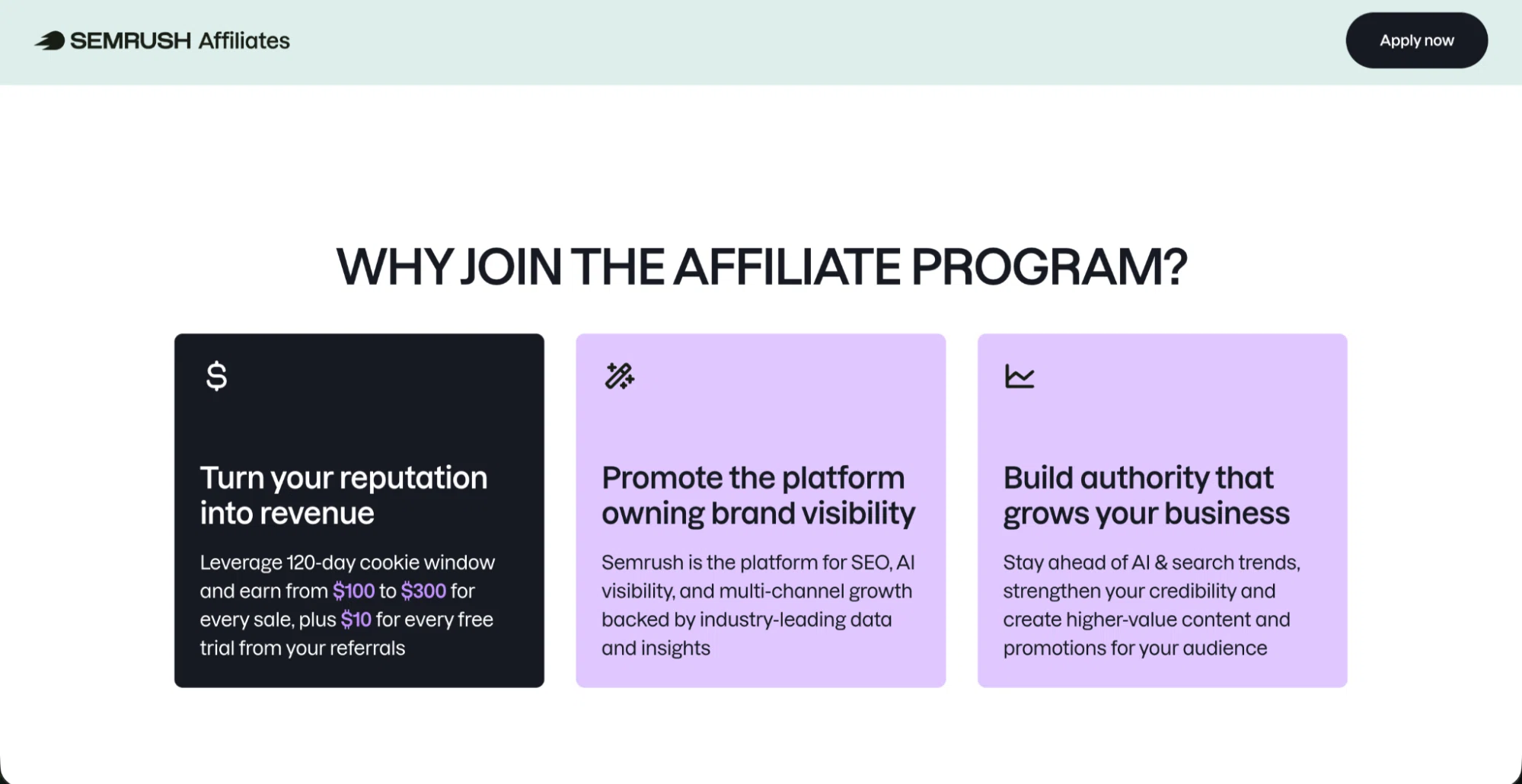
Semrush’s affiliate program landing page clearly displays their cookie window and commission rate.
Semrush’s affiliate marketing for SaaS landing page earns its reputation by doing three things most B2B programs don’t.
It leads with the full commission structure right after the fold. Partners can earn up to $300 per sale and $10 per trial activation, with a 120-day cookie window. That specificity indicates a program that takes partners seriously. Most B2B SaaS programs describe their commissions as “competitive”, while Semrush puts the numbers front and center.
It contextualizes the cookie window. Rather than just stating the 120-day window, the page makes clear why it matters: SaaS buying decisions take time. Partners reading this understand that Semrush has designed the program around how their audience actually makes purchasing decisions—not around what’s easiest to administer.
It segments by promotional channel. The page makes clear that the program serves SEO bloggers, digital marketing educators, and tool comparison sites differently. Partners can immediately identify whether they’re a fit.
What to take from this: If you’re a B2B SaaS brand, lead with specifics. Put commission rate, cookie window, and payout structure above the fold. And contextualize your cookie window against your sales cycle.

From in-house to powerhouse: Semrush’s affiliate program transformation
Learn how Semrush implemented cutting-edge technology to optimize affiliate relationships and achieve a remarkable 400% increase in new partner sign-ups.
Marketing/CRM SaaS: HubSpot
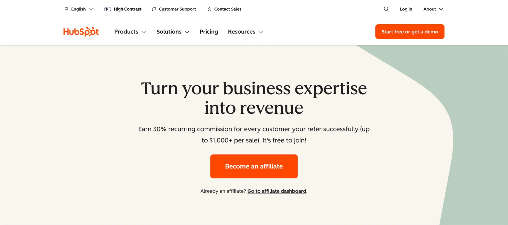
Hubspot’s affiliate page highlights how much partners can earn per sale.
HubSpot’s program speaks to content creators who want to build a revenue stream alongside their educational content, and the positioning reflects that.
The tiered structure does the work of recruiting ambitious partners. HubSpot’s three-tier system gives creators a visible growth path from their first sale. Benefits like dedicated account managers, website audits, and co-branded landing pages are positioned as achievable milestones, not just listed features. For creators building a long-term audience, the path matters as much as the starting commission rate.
The resource center is the product. HubSpot offers more than 400 marketing assets—copy banks, banner images, promotional tips—and frames them as a growth toolkit. For creators just starting to monetize their content, this removes one of the biggest barriers to promoting the program.
What to take from this: If your program targets creators rather than performance publishers, structure this creator marketing page around their growth journey. Tiers and visible progression matter more to creators than flat commission rates. Also, invest in your resource center since the quality of your assets signals the quality of your program.
CPG: Olipop
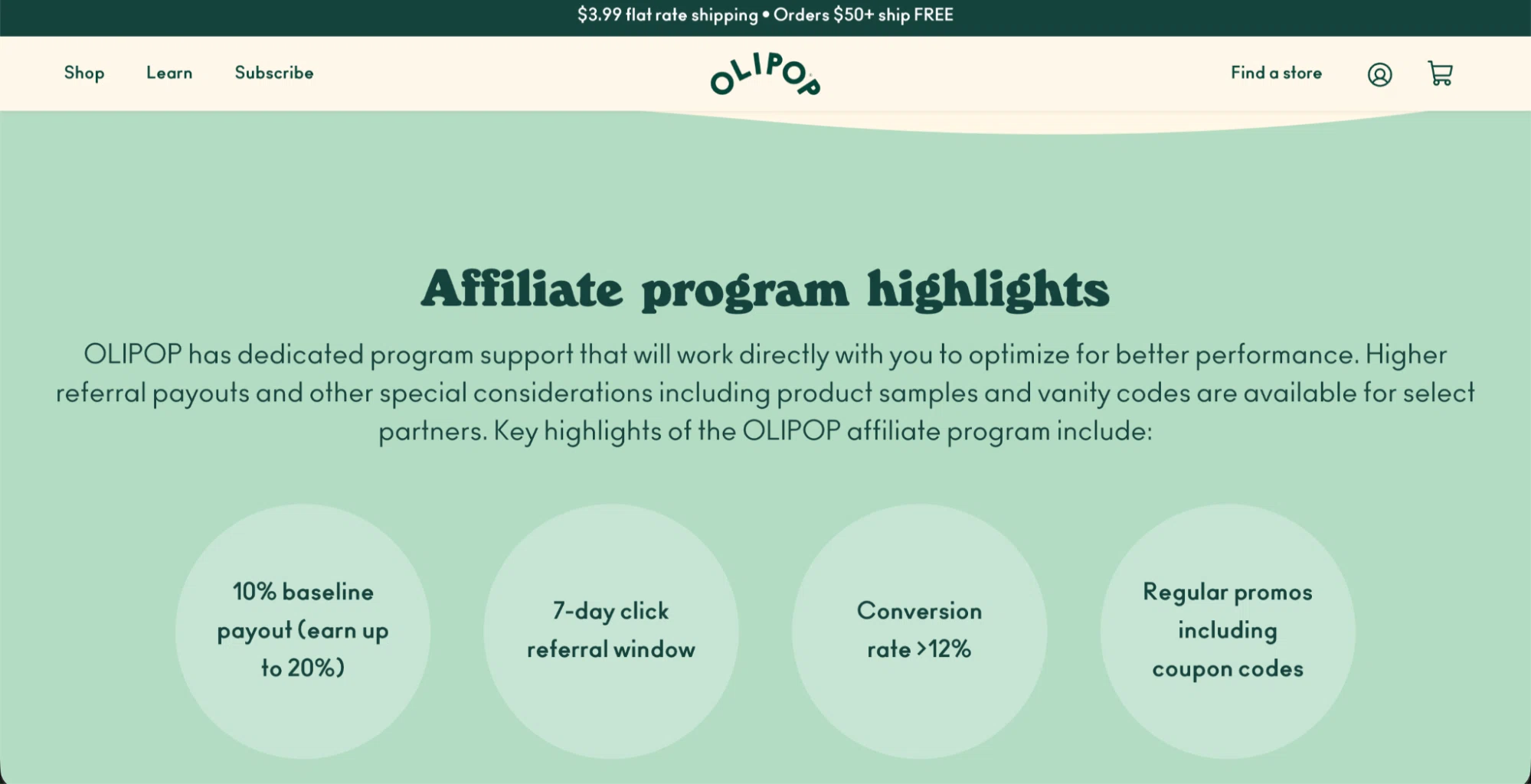
Olipop’s affiliate landing page outlines the key benefits of joining the program.
Olipop’s program leads with community and brand alignment—exactly right for a CPG brand whose best partners are lifestyle creators, food bloggers, and wellness creators.
The landing page sells the brand before it sells the program. Prospective partners aren’t just being recruited to an affiliate program; they’re being invited to represent a brand they already know. The page assumes partner affinity and builds on it, rather than starting from scratch to explain the brand.
The performance structure is creator-friendly. A 10% baseline commission that scales to 20% for top performers, combined with dedicated promo codes and product samples, suits creators who rely on authentic product endorsements rather than banner placements. Olipop is transparent about the 7-day cookie window. For a brand with an impulse-purchase dynamic, that transparency is more credible than an inflated number that doesn’t match how the buying cycle actually works.
The dedicated program support is positioned as a partnership, not a help desk. Partners get hands-on support to optimize for performance, not just a dashboard login. For creators newer to affiliate marketing, that reassurance matters as much as the commission rate.
What to take from this: If you’re a DTC or CPG brand, your affiliate marketing for ecommerce page should feel like an invitation, not an application form. Lead with brand story and community. And be honest about your cookie window—creators will respect transparency.
Home goods/retail: Castlery
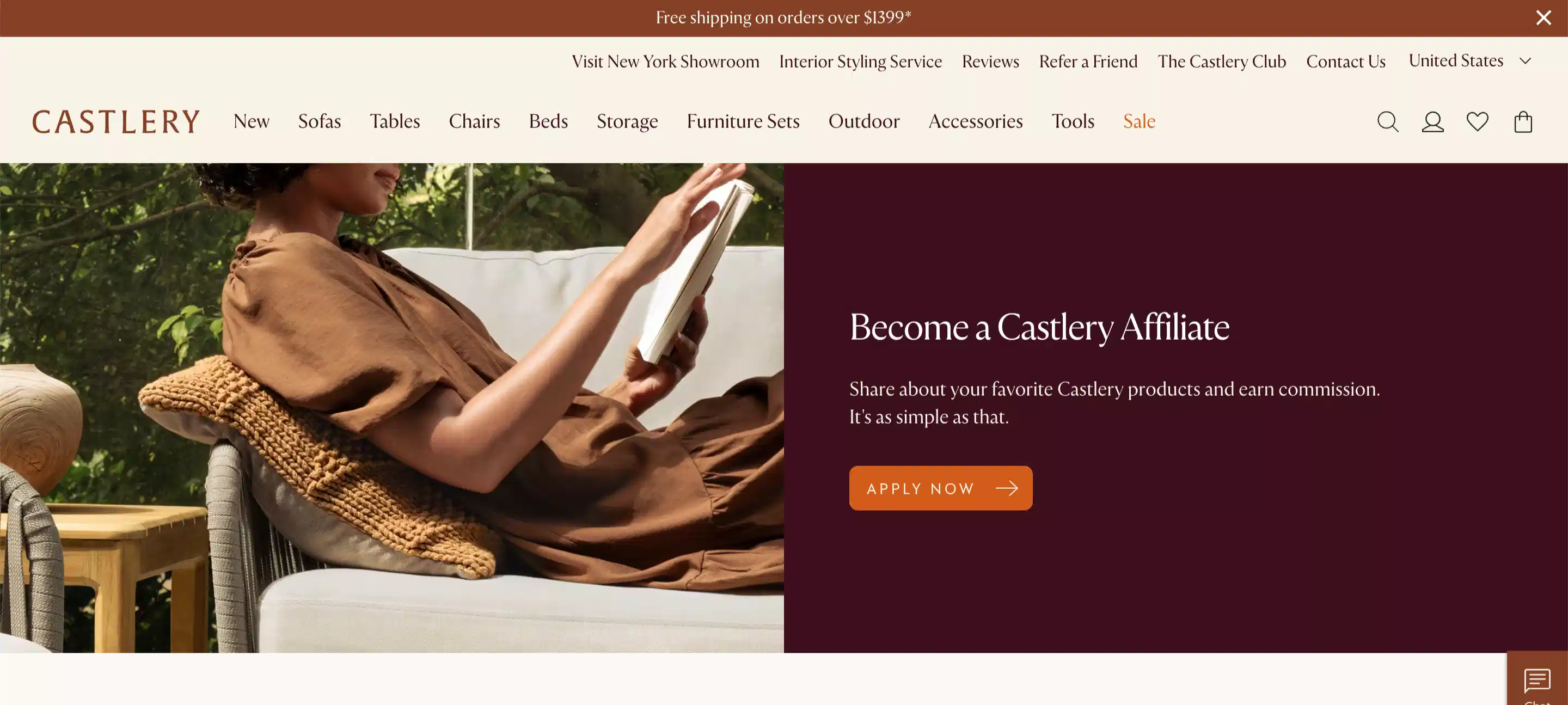
Above the fold, Castlery’s affiliate landing page explicitly mentions ideal partners: media partners, content sites, and networks.
Castlery’s program solves a problem specific to high-consideration retail: furniture is not an impulse purchase, and partners need to know the program is built around that reality.
The program clearly defines its partner profile. Media partners, content sites, and networks are called out explicitly, and this shows interior design publishers and home lifestyle creators that this program is built for them, not for coupon sites.
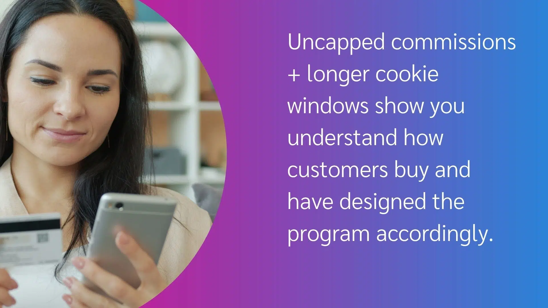
Castlery’s affiliate landing page highlights the uncapped commission potential and long 30-day cookie window—ideal for longer consideration purchases like furniture.
The uncapped commission structure is the main attraction. Castlery’s page leads with the fact that there’s no ceiling on performance bonuses. The more partners sell, the more they make. For home décor publishers and interior design creators whose content directly influences purchase decisions, uncapped commissions show that Castlery treats affiliates as a real revenue channel.
The 30-day cookie window fits the buying cycle. Furniture buyers research extensively before purchasing. A 30-day tracking window gives partners credit for the awareness they create, even when the purchase comes weeks after the initial click. The page conveys this implicitly by presenting the window alongside the commission structure, rather than hiding it in the terms.
What to take from this: If you’re a high-consideration retail brand, acknowledge the length of your customer’s buying journey. An uncapped commission structure and a generous cookie window aren’t just program features—they indicate that you understand how your customers buy and have designed the program accordingly.
How to build your affiliate program landing page: a checklist
Use this checklist to build your page from scratch or audit an existing one.
Above the fold
- Headline states what the partner gets—not what your brand does
- Commission rate or range is visible without scrolling
- Primary CTA button is visible and uses action-oriented copy
- Cookie window is stated prominently
Commission and program structure
- Commission type is clearly explained
- Cookie window is stated with context (why it suits your buying cycle)
- Payment schedule and minimum payout threshold are visible
- Tier structure is explained if applicable, with clear criteria for advancement
- Approved promotional methods are listed
Resources and support
- Asset library is described with specifics, including the number of assets and formats available
- Account manager availability is stated clearly
- Reporting and tracking capabilities are described
- Onboarding support is mentioned
Partner qualification
- Ideal partner profile is described (audience, niche, content type)
- Minimum requirements are stated if applicable
- Partner types actively sought are listed
- Application review timeline is stated
CTA and application
- Second CTA appears at the bottom of the page
- Alternative contact path exists for large partners
- Application process is explained briefly
Comparison: what each vertical prioritizes
| Vertical | Lead with | Cookie window | Key differentiator |
| B2B SaaS (Semrush) | Commission specifics + cookie window | 120 days | Commission at every stage—sale, trial, signup |
| Marketing/CRM SaaS (HubSpot) | Creator growth journey | 180 days | Tiered progression + 400+ asset library |
| CPG (Olipop) | Brand community + invitation | 7 days | Product samples, promo codes, creator-first language |
| Home goods/retail (Castlery) | Uncapped commission structure | 30 days | No cap on bonuses, 30-day window matches buying cycle |
FAQs
An affiliate program landing page should cover five things in order: your commission structure (rate, cookie window, payment terms), your resources and support offering, your ideal partner profile, social proof from existing partners where available, and a clear application CTA. Everything else is secondary.
An affiliate program landing page should be long enough to answer every question a prospective partner has before applying, and no longer. Most high-performing programs cover everything above the fold and in one or two scrolls below. If a partner needs to read a 3,000-word page before deciding to apply, the page is doing too much work.
Yes. Hiding your commission rate increases friction and signals a program that doesn’t value partner transparency. Prospective partners will find out your rate before they apply—either from your page or from affiliate program review sites. Putting it front and center on your own terms is the stronger move.
Affiliate program landing pages that convert well are specific, not aspirational. They include a specific commission rate, a specific cookie window, and a specific resource library. Vague promises of “competitive commissions” and “dedicated support” lose high-quality partners to programs that show their work.
High-quality partners review multiple programs simultaneously. What sets your program apart is demonstrable support infrastructure, such as the quality of your creative assets, the specificity of your tier structure, and the accessibility of your team. Commission rate gets partners to look; program quality gets them to apply.
From landing page to program: what comes next
A strong affiliate program landing page gets the right partners to apply. What happens after that determines whether they perform.
The programs that compound over time—the ones where partner quality improves, commission efficiency rises, and the best publishers keep coming back—share one characteristic: they built the infrastructure before they needed it. This infrastructure includes a recruitment page, onboarding workflow, tracking setup, and reporting cadence. The landing page is the first step in that system, not a standalone conversion tool.
Once your page is live, the next decisions are operational: how you vet incoming applications, how quickly partners get approved, and whether your tracking is set up to give every partner accurate, real-time visibility into their performance. Those decisions determine whether the partners your page attracts stick around long enough to produce results.
Your next step: audit your current page against the five-element framework
Pull up your existing affiliate program landing page or the one you’re building, and run it against the checklist in this guide. Specifically:
- Is your commission rate visible above the fold, with context?
- Does your partner description help a prospective partner self-qualify in under 60 seconds?
- Is your cookie window stated clearly, with a brief explanation of why it fits your buying cycle?
- Is there a clear alternative contact path for large partners who want to discuss terms before applying?
If any of those answers is no, that’s where to start.
Want to learn more about building a solid affiliate program strategy?
Check out these impact.com partnership resources:
- How to build a successful B2B affiliate marketing program: Tips from industry experts [Blog]
- How to find affiliate partners: 6 modern strategies for high-impact growth [Blog]
- How to build an affiliate marketing commission strategy by ignoring your competitors [Blog]
- Castlery experienced a 12% AOV increase within a year using impact.com [Case study]